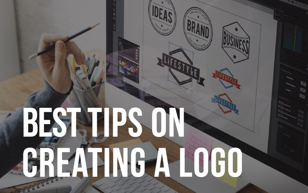
Today’s topic is “Important Details To Keep In Mind When Creating A Logo.” Do you ever come across a logo and you’re not able to make it out, you’re not sure what it is? Unfortunately, this happens a lot.
Today, we will be discussing a couple important factors when it comes to designing a logo. In today’s world, we have a lot of options to creating a design. We can go online, we can hire a contractor, or we can hire an agency. This can be overwhelming because there are so many resources.
At the same time, having a logo that reinforces your brand is critical. The reason it’s so critical is because a logo should be the point of entry to your brand. This is how everybody identifies your business, your services, your product.
I’m going to discuss several details to keep in mind when having your logo designed, and used in your marketing materials.
Since the logo is supposed to set the theme for your business, it’s important to go ahead and spend some money on having your logo designed. If you’d like to do it yourself, you can, but it’s going to take much longer. It’s probably going to be very frustrating and it may not look very professional.
The best thing to do first is to do your research and find other options that you like of logos and other competitors. That way, when you hire a contractor or a designer, you can give them something to go off of. I prefer using 99designs online to run a contest. It’s reasonably priced, and you get lots of options.
I have used other websites, but the results weren’t that great. I truly believe that you get what you pay for. If you’re going to pay $50 for a logo, you’re going to get a $50 logo, and it’s probably going to look like other logos out there.
You can also hire a contractor or you can hire an agency, but at the end of the day, this is one of the most important pieces to spend money on other than your website. When reviewing your logo, keep the following in mind, design wise, does the logo fit your business? Do the fonts and colors represent what you stand for?
Scalability is important too. Are you able to take your logo and make it small and embroider it on a hat, and then blow it up really big and put it on a huge banner at? Your logo should also fit into some shape, whether it’s an oval, a circle, a rectangle, or a square, there shouldn’t be any pieces of the logo that are flying off and far away.
The reason for this is it makes it look simpler, it makes it look cohesive, and also, whenever you put it on a website or a brochure, it always goes into the same space. Go easy on a fax with your logo. When it comes to drop shadows, it may look good on a white background, but when it comes to other applications, it’s probably not going to work.
Also, it’s going to muddy up the logo, especially, if you have to see the logo from far away. A couple things to keep in mind, also, whenever having a designer creating your logo, make sure you get several variations and go through two to three steps refining the logo.
Finally, when you have your files delivered, make sure you get a variety of files. Like a Photoshop file, an Illustrator file, a JPEG, and that it includes CMYK and PMS colors for print and digital. Out of all the files that you need, the most important is a vector file. That’s probably going to be in InDesign or Illustrator, and the reason is for scalability.
If you take a vector logo and you make it huge, like 20 by 30, it’s still going to keep its resolution. It’s going to be nice and crisp. If you do the same in a Photoshop file, and try to make it 20 or 30 inches big, it’s going to look rasterized and muddy.
Here at Merge Forward, the agency that I run, we create a logo library for our clients, which will include sets of logos in black and white, color, grey, and inversed. This way, our clients can pull any kind of images for any kind of application. We also include a variety of files per logo, so that way, the client can pull those easily.
When having a logo designed, ask for a logo library, so that way you can pull whatever file you need for any type of application fairly quickly. Recently, we worked on a project for a wine company, a wine distributor. They created a logo online for $25. When I looked at the logo, it had three or four different fonts within the logo which is a big no, no, got to keep it simple.
Second of all, the piece that was a grape coming out of the logo was very muddy, had way too many layers to it, so it wasn’t flat looking. Before you knew it, when it became small, it started looking like something odd. You couldn’t even tell what it was.
When we redesigned the logo, we made sure that everything was nice and crisp. That whenever it was big or scaled down, you could see what the image was.
Moving on for today, our three forward strategies to remember when reviewing and receiving logo files are:
Number one, the design of the logo. Is it within a shape and is it appropriate for your industry?
Number two, scalability, and make sure it’s versatile.
Number three, make sure that your delivered files are vector. That’s the most important. Vector will usually be an InDesign and Illustrator.
Our takeaway for today is the logo is the most important feature of your brand, and should be used consistently on all your marketing.
If you enjoyed this podcast, please share with your friends and colleagues. If there are any other topics on running a business, or building a brand you’d like to hear about, please leave a comment.
Remember the time and energy you put into your brand determines the success of your business.
Thanks,
Kasia Johnson – Forward Mastery
Keep rocking and dream big
FOLLOW ME ON SOCIAL!
https://www.facebook.com/ForwardMastery/
https://www.instagram.com/kasiamjohnson/
https://twitter.com/kasiamjohnson/


Recent Comments